
Asset Distribution Software Directions |
| Site Information (is listed below. The financial planning software modules for sale are on the right-side column) Confused? It Makes More Sense if You Start at the Home Page How to Buy Investment Software Financial Planning Software Support Financial Planner Software Updates Site Information, Ordering Security, Privacy, FAQs Questions about Personal Finance Software? Call (707) 996-9664 or Send E-mail to support@toolsformoney.com Free Downloads and Money Tools Free Sample Comprehensive Financial Plans Free Money Software Downloads, Tutorials, Primers, Freebies, Investing Tips, and Other Resources List of Free Financial Planning Software Demos Selected Links to Other Relevant Money Websites
|
Tips on formatting Excel pie charts are mid-page
Generic directions for using the Asset Distribution Calculator, and most of the other investment software in general, is on the first section of the Comprehensive Asset Allocation Software directions. Step 1: Determine how many accounts you'll be working with. For example, each IRA would be a separate account. Basically everything that has a separate financial statement is a separate financial account. Open the workbook (Asset Distribution.xlsx) and go to the sheet that has the same number of accounts. For example, if the husband wife each have a 401k, an IRA, and a joint investment account - go to the sheet named Asset Distribution - Five Accounts.xlsx The point of these investment tools is to input what they currently have, so you can see what percentages are currently in each asset class (for each account, and when all of the accounts are combined). Then you shuffle things around in the Proposed section to arrive at a better mix of asset classes. Then when they engage do you to do it, you'd make the trades. There are no limitations (nor guidance) on what types of investments, or asset classes, you can use. So you're totally winging everything ad hoc as you go. Step 2: Find the cell where it says account name, and change it to the name of the client's account. For example, John Sample's WidgetsRus 401(k). Do the same thing in the Proposed section by scrolling down to that cell and changing it (some of the bigger account tools have cell references that automatically do this). Do all of the account name inputs in both the Current and Proposed sections first to help avoid confusion later. Step 3: Get out whatever financial data you have on the client's account(s), and first separate them all by accounts. It helps to make paper copies of their statements, so you can write the asset class names you want each investment classified into on the copied page next to each investment (and other things, as you'll see). Plus everyone likes to get their statements back in tact the way they were given ASAP. When you have all of their accounts separated, decide which asset class each current investment held in the account should be assigned to (these are judgment calls on your part). Nothing is protected on these sheets, so you can change the names of the asset classes to whatever you want them to be. Step 4: Input each investment's name into row D to the right of the asset class you've decided to put it in. Then input the dollar amounts held into column G. Percentage data, and data used to make the pies, will automatically populate columns I, K, & M. Repeat until all of the first account data are input. All of the #DIV/0! symbols will go away when everything is populated. It's up to you whether you want to leave unused asset class rows blank, or delete them. If you leave them blank, then you'll have the pie chart problems below. If you delete them, then you'll have to spend time checking formulas to make sure all of the references go to the new locations. It's easier to leave them because it helps with the presentations (by making the clients aware of all of the unused viable asset classes to invest in), you'll use up more asset classes in the Proposed section, and once you get the hang of formatting the pie charts, it will end up being less work. On the other hand, if your methodology is such that you're always using the same (lesser number) asset classes, then you probably would want to delete the asset classes you won't be using, do all of the formula editing, then save the new templates so it will open up to your way of doing things all of the time. Step 5: When everything is input into the Current section, check to make sure all of the Totals and Grand Totals are correct. There are numerous easily made input errors that will make it not total correctly. Make sure the percentage data in column L adds up to 100%. If it doesn't then you input data wrong somewhere. Step 6: Don't worry about formatting the pie charts now, continue on to the Proposed section. Input your recommendations, starting with the first account. You're free to do pretty much anything you want, as long as the bottom-line dollar amounts are the same for each account. There is a check number at the bottom of each proposed account in column L to tell you how much you're off by. When you're good, it will read $0. You can actually shuffle things around the way you want to in the Real World. Be aware of minimum trade amounts, availability of funds, and if currently-held investments are not to be sold (by client wishes or account constraints, etc.). There are numerous reasons why investments can't be sold and why ones you want to buy, can't be, etc. It's up to you to figure all of this out - before you present it to the client. The point is to make both an overall picture, and an account-by-account asset allocation that better matches the clients' lives better than what existed before. There is no calculation tool to tell you what you should be shooting for (which is why it's called asset distribution and not asset allocation), so just make it up as you go. Step 7: Once you've reached a mix that you like, then use the check formulas in columns J and L to make sure they all say $0 and 100%. If they don't, then you made a mistake that needs to be fixed. You can feed us a few bucks, and we'll look it over if you didn't buy support. If you have support, then we'll look it over to see if you did thing correctly. Step 8: Printing. Use Print Preview to first tell how many total pages Excel thinks there are to print. Then go to the Print... menu so you can tell it to print half that many. The point here is to not waste time and paper printing anything left of column I. You'll have to do the usual format tinkering with rows and columns to make it look perfect. Now download this small spreadsheet to learn how to deal with Excel's pie chart problems: To download, Right click on the link below, and then choose "Save (Target) As..." to save to your hard drive. Then find and open with Excel. Download this little version of the asset distribution demo to see what the charts looked like when you started, and what they should look like when you're done. Then follow along with the directions below.
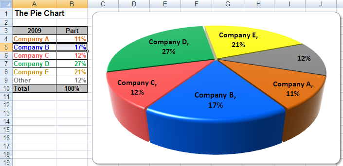
This Section is to Help Format Excel Pie Charts You can use this tutorial to help formatting go better when you make any complex pie chart in Excel. First, many of these terrible formatting problems with Excel charts were solved with the 2007 version (when the file extension changed from xls to xlsx). Then more were resolved with Excel 2010, and then 2013. So a lot of this is moot these days, as they continuously fix more of their mundane malfunctions. Tip: Always WAIT for your computer to get done thinking before you move on to the next step. Even with brand new super-fast computers, Excel is slow at this and if you don't, then it may crash on you (making you start over). This rarely happens with Excel 2016. The best way to tell if it's done, is to wait until your display makes a change of some kind that reflects what your last action was. Most of the time, you can tell it's done when the yellow text box comes up telling you where you are. Or the cursor will change, or when it says "Ready" at the bottom left of Excel. This tutorial uses the Asset Distribution Tool as an example, because it has the most leaders on pie charts (it has more pie slices). The more rows / empty rows of data the chart has to read to make the pie, the more you'll have to tinker with it to make it look right. There are two sheets in the example workbook: Pie Charts Before and Pie Charts After Go to the before pie sheet now. See how both pies are both sized wrong, and the leader lines showing what the slices are totally out of whack? That's the problems this is trying to help you solve. Please note that this is an MS Excel problem and has nothing to do with our programming. This gets better with each new version of Excel, but hey, it's Microsoft what are you gonna do?! Here's the Step-by-step Solution The first thing to do is to increase your zoom magnification slider so the pie chart is BIG on your monitor, as least half of the screen. First the difference in the way row 6 looks was done by right clicking on it (so all of row 6 highlights), then go to Row Height and making it 50. Then while still highlighted, go to Format, Alignment, and under Horizontal, choose Center Across Selection; under Vertical, choose Center, then click the Wrap Text box. Do the top pie first - it's easier and will warm you up for the hard stuff. If you go to move a label, and the whole thing moves, then just Control Z to undo. First, ensure all of the pie slices are set up to have data labels. Excel likes to screw this up by selectively making them come and go at random. Click inside the pie so the whole inside of the pie highlights. Right click and choose Format Data Series. Choose Data Labels. Click the radio button for Show label and percent. After you do that, Excel may screw up the formatting, so right click on one of the labels, and go to Format Data Labels. Change the font size, then go to Number and go to Percentage, then change the Decimal places back to 1. Now reset everything by clicking on one of the labels until they're all highlighted. Then right click which will bring up the Format Data Label menu. Choose Alignment, Label Position, and click Center, Center, Best Fit. This will screw them up, but it will help in the problem where they're all bunched together, making it near impossible to separate and delete or move. Now they will separate and move around better. To fiddle with just one label when it won't separate, press the left or right arrow key until the ONE label you want is highlighted. Make sure that's the one you want (by undoing if it's not). Now you can grab it by the tiny border and move it, or press the delete key. If you did it right, then just that one label (with the 0% value) was deleted. To format the pie: Click 1/8 inch to the top left of the pie. In other words, follow the line separating the red and orange slices, and click just a little bit outside the pie (but still within the chart). If you didn't do it right, then everything will be selected. If you did it right, just the pie will be selected, and the pie will now be encircled by a box with corner handles that you can click and drag on. Click on the corner handle that is in the direction that you want to drag it to. The point is to first make it bigger. In this case, the top left handle was clicked on, then dragged in the NW direction to make it bigger. Now that it's the right size, you want to format the text at the end of each leader line. In other words, make the text the right size, percentage, one decimal place, and put it in a spot that looks good. The Leader Line is the line stemming from the pie slice to the text. You can turn them all off, or separately by pie slice, if you want to, by deselecting that checkbox in one of the chart options menus (get there by right clicking the pie). The first thing to do is see if Excel is smart enough to do it itself. Right click on the center of the pie until all of the slices and the text / leader lines are highlighted. Click on the outside of the pie until just the text and leader lines are highlighted. Press the delete key to delete all of the text and leader lines. If the whole pie deletes, then you selected the whole pie, and not just the text / leaders. If so, press Control Z to undo. Then right click again, and choose, Format Data Series. Choose Data Labels. Click the Show Label and Percent button. Most of this will do the trick, but if not, detailed directions are below. If any of the text is outside of the working area, then you'll have to click on the pie, and drag it in the opposite direction so you can see and drag the text close to the pie so you can deal with it, then move the whole pie back. Sometimes you'll need to make the pie smaller to get to the rogue leader line and text label. Click on any text at the end of a leader line. They will all highlight. Now right click on any of the selected items, and a menu will come up. Choose Format Data Labels, then Font, and then click the font size you want. Now they are all the right size (instead of some being different). Now comes the tricky part - moving each leader line / text label to the right locations. First click on things until they are all highlighted at the same time. Wait until what you clicked on is done before clicking on something else. When they are all selected, then click on them one at a time. If it looks like it wants you to edit the text (by highlighting the whole word), then press escape or click somewhere else, or it will be deleted. Click on each item and drag it to the right location. Don't let up after you click on it. You first have to have them all selected by clicking on any of them, then you have to click and hold each one and move it at the same time. When you let up with one, then you can do the others. Save your work after they are all where you want them (and if there's more than five, you may want to save mid-way). If you want to delete items with 0% then you'll have to do this when that item only is selected, or they will all go away. When only it's selected, press the delete key once. Try hard not to make a mistake. The problem is that if you make a mistake, then undo, they will all usually go back to being screwed up, then it may crash. Excel added new features in '07 that makes dealing zeros better. When inside the Select Data... section, click on the box at the bottom called "Hidden and Empty Cells." If you're lucky, Excel just may smart enough to do what you want without having to go through all of this "stuff." If at any time you make a mistake like this, where you click undo (or Control Z), and it didn't go back to the way it was, save your work. Now, when you've conquered all of that, you may want to change the colors of the each slice. Click on the pie anywhere, and it will be selected. Now aim well and click on just the one slice you want to change. It will highlight. Now Right click on the highlighted slice, and the menu will come up where you can Format Data Point, then go to Patterns and change your color. Okay, that was the easy part. Now on to the hard part - the Current Asset Breakdown pie chart. This is really hard because of all the blank rows in your data range. These charts are getting their data from column K (the asset class and investment vehicle's name), and the percentage held in column M. Now you can see all of the blank rows in that data range. This makes two pie chart problems: First, it just looks like a mess, because Excel doesn't know not to make a leader line and text in the pie for blank rows (zero values). So you'll need to delete them all, one at a time. Repeat the step above and make the overall pie the right size, then make the text the right size. Try 8 point first. The first thing you'll notice, is that it's very hard to find the right place to click on the pie to drag it and make it bigger. So here is what to do about that: Click outside of the pie so you're on a cell (click on any cell in column N to be sure). Now you can go to View, Zoom, 200%. Yes, 200%. Now you can scroll around until you can get a grip on the pie. Make it MUCH bigger. Now you'll have to click on an outside cell again, this time use a cell in column A. Now reset your Zoom back to 75%. Don't freak if your pie is way too big now. At least now you can do something with it. Grab it again and make it the size you want. Save your work! Now click on the text labels and then right click, and change the font size to 8. Save your work now again. Now you can mess with the data labels. Click outside the pie to reset the selection mode (anywhere in column N again). Now click on the text labels. They all are selected. Now try to only pick the ones with text, and not the ones with 0%. Just click once, hold, and then move them to where you want them to be. Save your work frequently. After you've moved all of the valid text labels to where you want them to be, you'll need to delete all of the useless ones that say 0%. If you don't care that they are there, then this would be a good time to stop and let sleeping dogs lie, as deleting them all is the hardest part. Here's how to delete them: First, in order to delete them, you'll need to move them one at a time, away from the pie. The ones that are away from the pie, you can delete by selecting them one at a time, then press the delete key. Remember to not press delete unless you're sure that only ONE 0% is selected! If not, all of your leads will go away, and they will all be messed up after you undo. After you delete each one, the whole chart will be selected. So you'll need to click on a text lead, which selects them all, then single click on another 0% lead. At the moment, there are still several that are close to the pie, you won't be able to do anything with them. To make things even worse, there are probably several of these critters all lumped together too (in a tree). You won't know until you try to move them away from the pie, and they won't budge. This worst case scenario is the "tree of 0% data labels." This is where you get a line with several zero data labels connected to them. This is annoying because it's very hard to separate them, which is needed to delete them one at a time. The only advice is to click below where the tree first comes out of the pie, to be able to select them individually. To be more specific: Grab a 0% lead that's close to the pie and drag it away from the pie. Several more 0% lines may appear. Start at the top one, and single click on it until only that one is highlighted. Press the delete key. After it figures it out, it will go away. You need to wait for it to go away before you move on, or it will crash. Save. Repeat until all of the 0% leads are gone. Now you are free to format the colors and make it look perfect. This may sound like a major pain, but after a few times, you'll remember the steps and it won't take long at all. Please remember that this is an MS Excel problem that can't be fixed, and isn't even in the latest version of Excel, so it's not particular to our financial tools. Then the only software product we sell that has this problem is the Asset Distribution Tools. Also please keep in mind, that at least you have the ability to control the charts. Most financial plan software won't even let you change anything. Read why Excel is the best platform for this, even though it seems annoying now |
Financial Planning Software Modules For Sale (are listed below) Financial Planning Software that's Fully-Integrated Goals-Only "Financial Planning Software" Retirement Planning Software Menu: Something for Everyone Comprehensive Asset Allocation Software Model Portfolio Allocations with Historical Returns Monthly-updated ETF and Mutual Fund Picks DIY Investment Portfolio Benchmarking Program Financial Planning Fact Finders for Financial Planners Gathering Data from Clients Investment Policy Statement Software (IPS) Life Insurance Calculator (AKA Capital Needs Analysis Software) Bond Calculators for Duration, Convexity, YTM, Accretion, and Amortization Investment Software for Comparing the 27 Most Popular Methods of Investing Rental Real Estate Investing Software Net Worth Calculator (Balance Sheet Maker) and 75-year Net Worth Projector Financial Seminar Covering Retirement Planning and Investment Management Sales Tools for Financial Adviser Marketing Personal Budget Software and 75-year Cash Flow Projector TVM Financial Tools and Financial Calculators Our Unique Financial Services Buy or Sell a Financial Planning Practice Miscellaneous Pages of Interest Primer Tutorial to Learn the Basics of Financial Planning Software About the Department of Labor's New Fiduciary Rules Using Asset Allocation to Manage Money Download Brokerage Data into Spreadsheets How to Integrate Financial Planning Software Modules to Share Data CRM and Portfolio Management Software About Efficient Frontier Portfolio Optimizers Calculating Your Investment Risk Tolerance |
© Copyright 1997 - 2018 Tools For Money, All Rights Reserved